By ID Atul Kulkarni dated 11-4-24
In the realm of interior design, colors are the silent storytellers, whispering tales of mood, personality, and ambiance within the walls of our homes. They have the remarkable power to transform a space, evoke emotions, and reflect the essence of its inhabitants. As an interior designer, harnessing the potential of color is akin to wielding a magical brush, painting dreams into reality. Let’s embark on a journey through the vibrant spectrum of colors, exploring their nuances and applications in the realm of interior design.
The Power of Color Psychology
Color psychology delves into the profound impact colors have on our thoughts, feelings, and behaviors. Each hue carries its own unique energy, capable of influencing our mood and perception of space. For instance, serene blues and greens evoke a sense of tranquility, making them perfect for bedrooms and meditation spaces. On the other hand, fiery reds and oranges infuse a room with passion and energy, ideal for areas where social interaction thrives, like dining rooms or entertainment spaces.
Creating Harmony with Color Schemes
In interior design, selecting the right color scheme is akin to composing a symphony; it requires a delicate balance of tones and hues to achieve harmony. There are various color schemes to consider, each offering its own aesthetic appeal:
Monochromatic: This scheme utilizes variations of a single color, creating a sense of cohesion and simplicity. It’s a timeless choice that exudes sophistication and elegance, particularly suitable for minimalist designs.
Analogous: Analogous color schemes involve colors that are adjacent to each other on the color wheel. They offer a subtle yet visually pleasing palette, perfect for creating a sense of continuity and flow throughout a space.
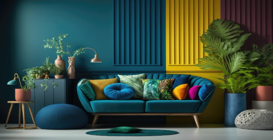
Complementary: Complementary colors sit opposite each other on the color wheel, such as blue and orange or yellow and purple. When paired together, they create a dynamic contrast that adds vibrancy and excitement to a room.
Triadic: Triadic color schemes consist of three colors evenly spaced around the color wheel. They offer a balanced blend of hues, providing both visual interest and versatility in design.
Accentuating with Pops of Color
While a well-defined color scheme forms the foundation of a design, incorporating accent colors can elevate the aesthetic and add personality to a space. Accent colors serve as focal points, drawing the eye and creating visual interest. Whether through bold statement pieces, such as a vibrant area rug or a striking piece of artwork, or through smaller details like throw pillows or decorative accents, pops of color inject life and character into a room.
Embracing Trends and Timelessness
In the ever-evolving world of interior design, color trends come and go, but timeless classics endure. While it’s tempting to succumb to the allure of trendy hues, it’s essential to strike a balance between contemporary aesthetics and enduring appeal. Neutral palettes, such as timeless whites, soft grays, and warm beiges, provide a versatile canvas that can be easily updated with accents of the moment. Meanwhile, incorporating elements of nature-inspired colors, such as earthy greens and organic browns, ensures a connection to the timeless beauty of the natural world.
Conclusion: Painting Dreams into Reality
In the realm of interior design, colors are the brushstrokes that breathe life into a space, transforming it from mere walls and floors into a sanctuary of style and comfort. By understanding the power of color psychology, mastering the art of color schemes, and embracing the interplay of trends and timelessness, interior designers can wield the palette of possibilities with confidence and creativity, painting dreams into reality, one hue at a time. So, dare to dream in color, and let your imagination run wild as you embark on the journey of creating spaces that not only delight the eye but also nourish the soul.


